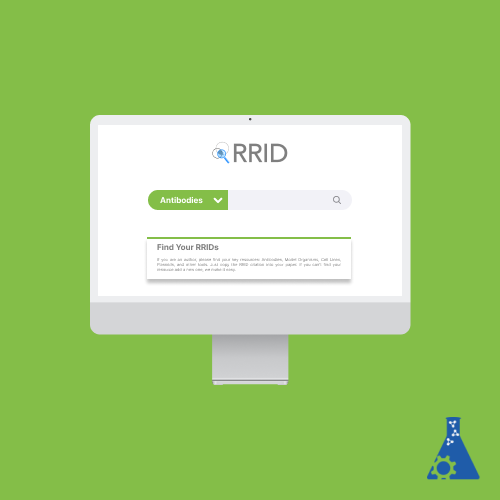
SciCrunch
Role
Designer, Researcher
Platforms
Desktop
Areas
Design, Research, Strategy

Overview
SciCrunch® is a data sharing and display platform for scientists to create custom portals where they can select searchable subsets of hundreds of data sources, brand their web pages, and create their community.
PROBLEM
Scientists need to find the critical biological resources outlined by the national institutes of health and new guidelines for reproducible research. However, the abundance of resources in the portal makes the navigation and search process insufficiently intuitive. Unclear instructions and inconsistent labeling can cause the search process to fail to produce expected results.
SOLUTION
Improve the accessibility to specific information, and streamline the overall user flow to increase the efficiency of the portal.
CLIENTS
Anita Bandrowski (CEO of SciCrunch), Isabella Froman
TASK
Improve how scientists search and report findings via the RRID search portal
TOOLS
Figma, Sketch, InVision Studio, Adobe InDesign, Adobe Photoshop, Google Suite
Research
QUESTIONS
- How do RRID portal users understand and navigate the search portal?
- What is the user flow of finding resources on the RRID portal?
- How can we reduce the number of steps a user goes through while interacting with the RRID portal?
GOAL
- Understand how users would ideally set up the search portal and filters
- Understand the goals of specific users, like a PhD-level biology student, and cater to those user goals
- Understand how first-time users interact with the RRID compared to seasoned users
Competitive Analysis
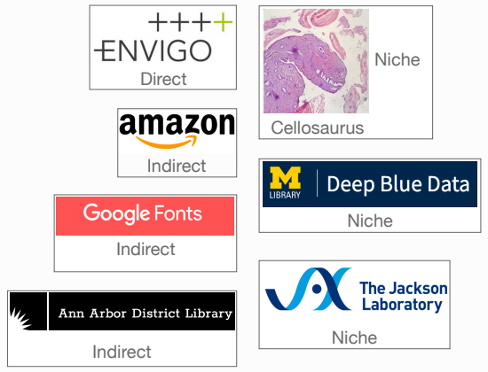
Our team conducted a competitive analysis to scrutinize how other competitors structure their search portals. We researched direct, indirect, and niche competitors of SciCrunch, looking primarily at the site navigation and search functions. Below is the list of companies we compared.
Key Insights
- SciCrunch’s RRID search portal is most similar to ENVIGO’s search portal
- Competitors allow users to pre-filter search results on their respective portals with fewer clicks than SciCrunch's RRID portal
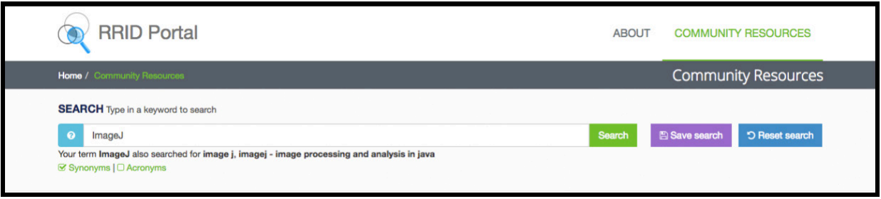
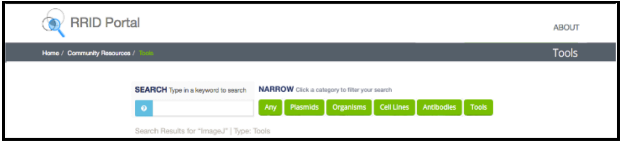
SciCrunch and its competitors have a similar design approach in terms of the website as a whole. Aspects such as the user flow and convenience are what differentiate the search portal from the competitors. For SciCrunch’s RRID search portal, however, it was relatively hard to tell what the search results are based on because there currently are no filters to organize the results.
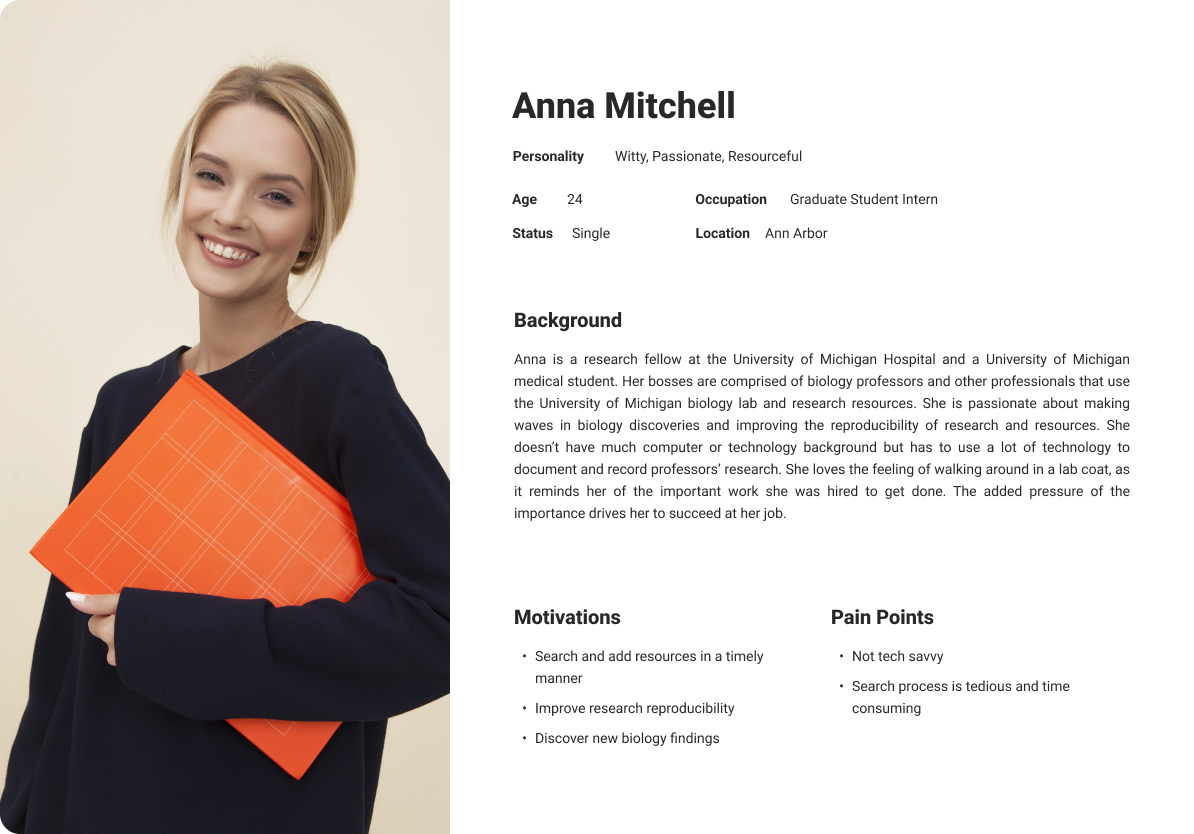
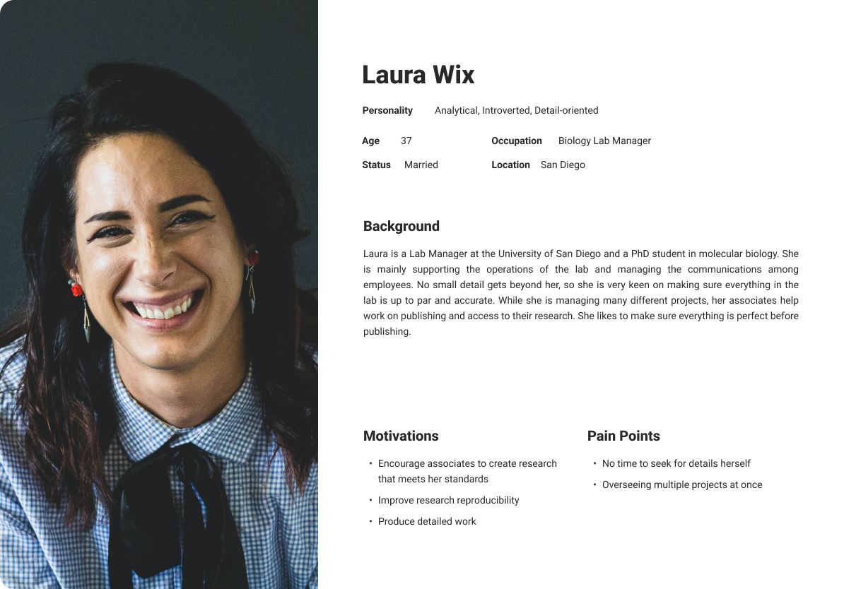
Personas
SciCrunch’s users mainly consist of graduate students, PhDs, postdocs, professors, and professional industry biologists. These target users constantly have tight schedules, so it was imperative for us to plan ahead and find participants who are willing to give us some time for us to interview.
Below we created two personas to give our research data a face we can emphasize and design for. These personas were pulled from user interviews based on their experience with the search portal.
DESIGN REQUIREMENTS
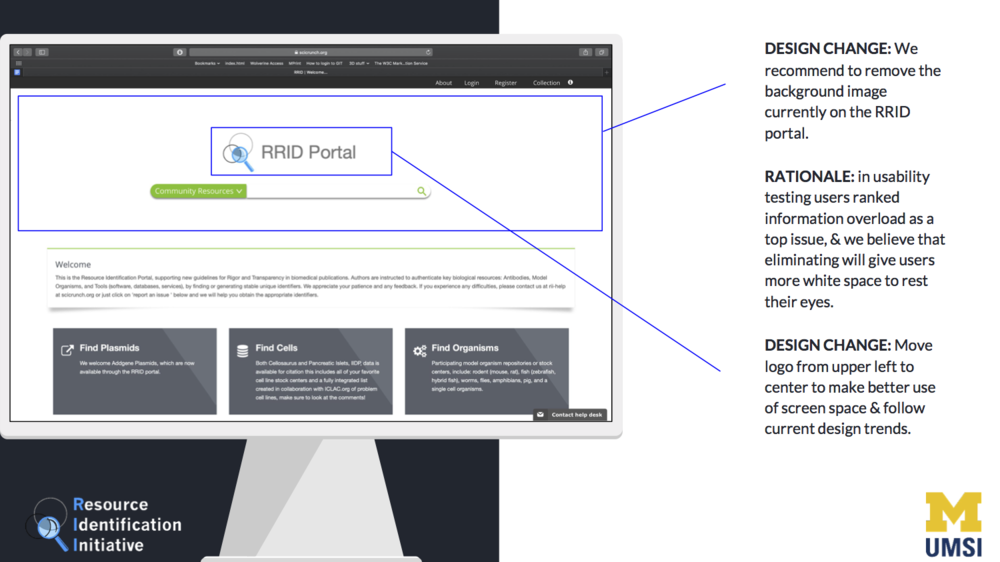
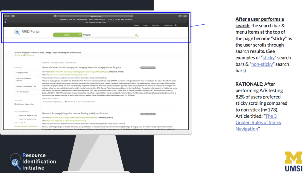
1. Reduce information overload to make search results page more accessible
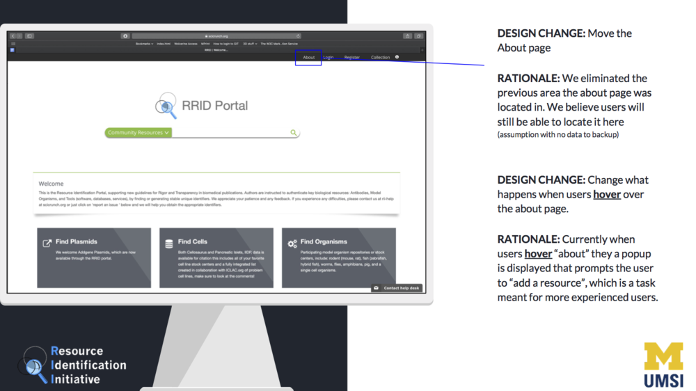
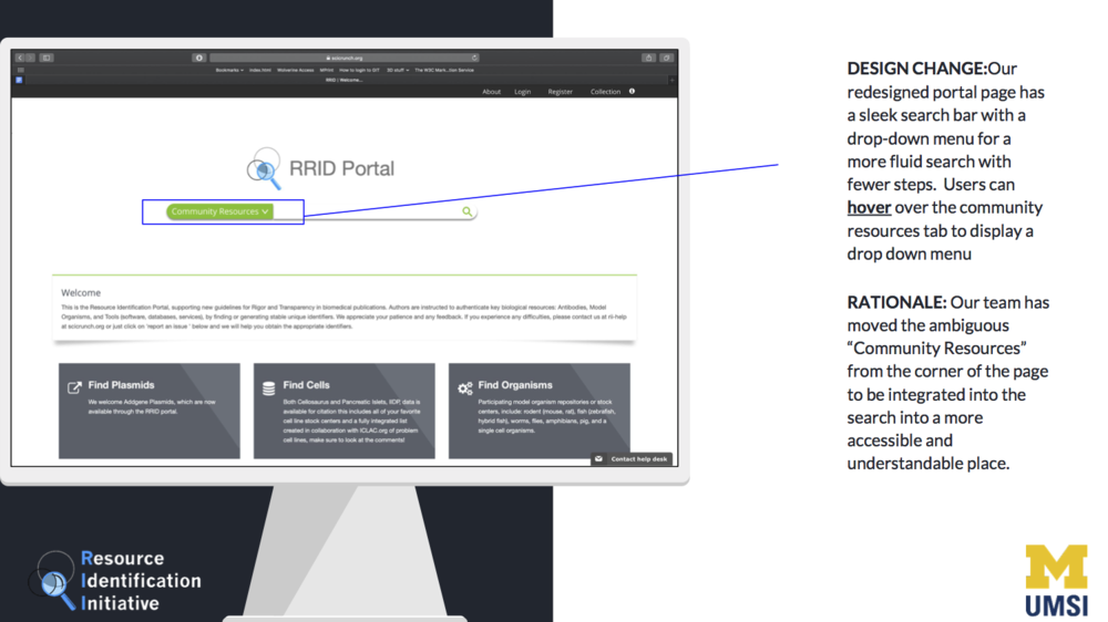
2. Re-categorize Community Resources to simplify the user experience
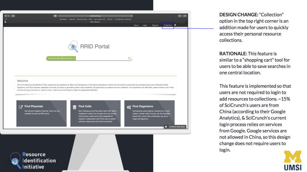
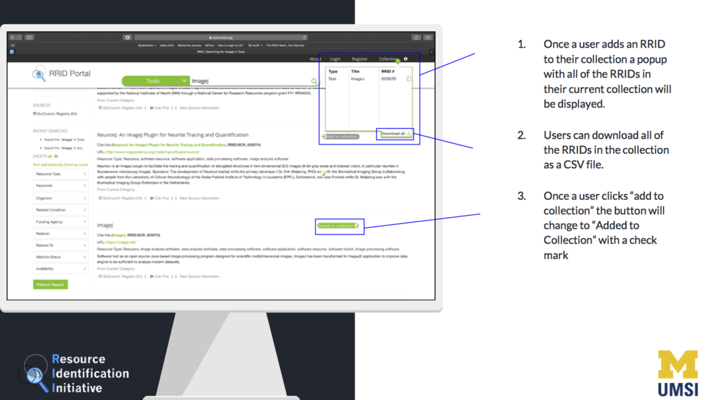
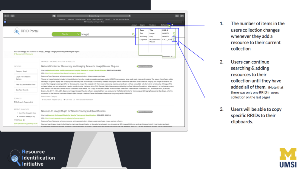
3. Clear up affordance when adding RRID to collections and make the feature accessible for users that cannot log in
Ideation
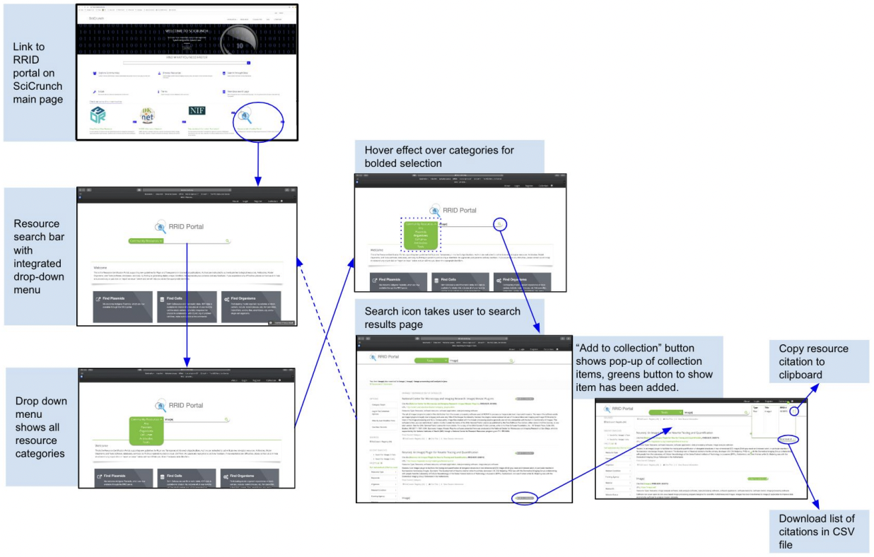
The design process for the SciCrunch RRID resources portal was primarily focused on personas and the UX requirements we identified during the research phase.
Our team started the process by brainstorming and understanding our UX requirements based on research and client feedback. Our requirements, however, had a shift of focus after gaining alignment with our client. Originally from user testings, most participants pointed out on making the help function more accessible and limiting information overload after searches are displayed on the RRID portal - which is what we initially focused on in our prototypes. Then the CEO of SciCrunch gave us the main objective of reducing the number of clicks for users to get the user goal. In light of this, our team formed new UX requirements that fit the client’s goals in minimizing the steps it takes to achieve the users’ typical goals, thus reducing the time spent searching.
Sketches
Sketches are useful when it comes to expressing, developing, and communicating design ideas. We conducted rapid paper prototyping on the search bar on the search portal. It was a specific feature of what our client wanted us to focus on because it is the portion of the page where most users tend to interact.
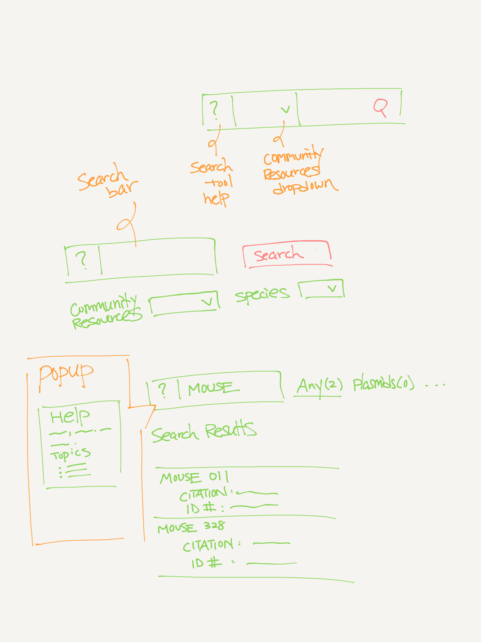
Prototypes
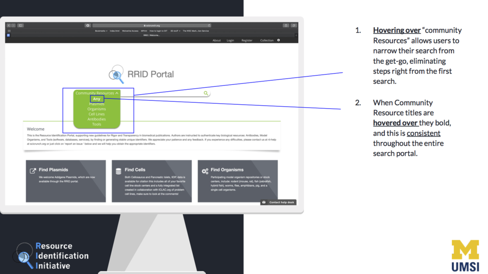
The prototypes below were where a lot of our innovations took place. We honed in on one particular search bar with six search categories, in addition to some aspects of the results page, which was a challenge on its own. As a team, we were eager to make grand changes that would alter the interaction with the entire site. Given the feedback from users and our client, however, we were able to narrow our scope to make helpful changes to the main search functionality and some search feedback. Though some changes were minor, they are profound in creating a faster search process. In the following iterations of the search portal, our prototype was supported by evidence from our user research that some of the information is confusing, in addition to information overload. Allowing users to filter their search immediately did cut down some of the overloads and made the search process more streamlined.
Original Version: Search bar with no option to select categories or filter down results
Version 1: Kept category bubbles on search results page and made search steps more clear
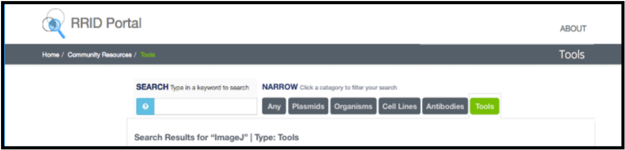
Version 2: Addition of tabs, greyed-out unused tabs
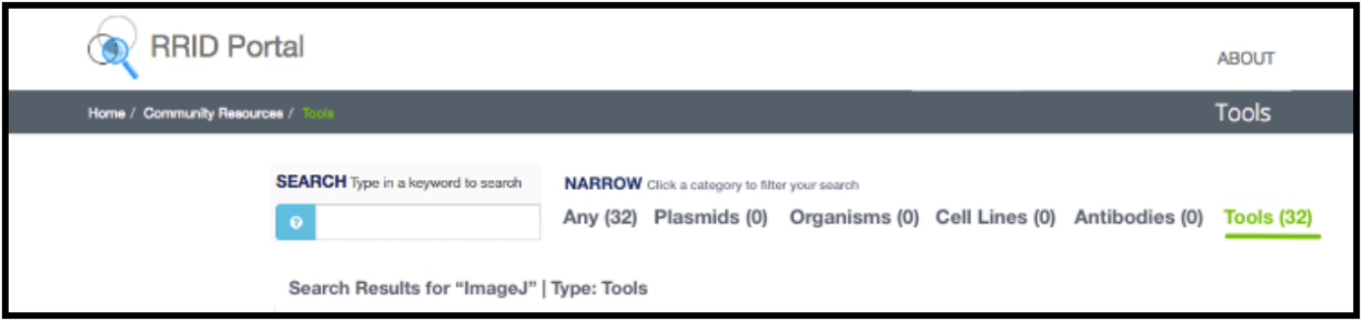
Version 3: Added search results numbers for more search assistance and easy filtering
Final Concept
Our solution will be a redesign of the existing SciCrunch search portal to help users efficiently navigate through the AI tool for identifying mice and antibodies used in studies.
Validation
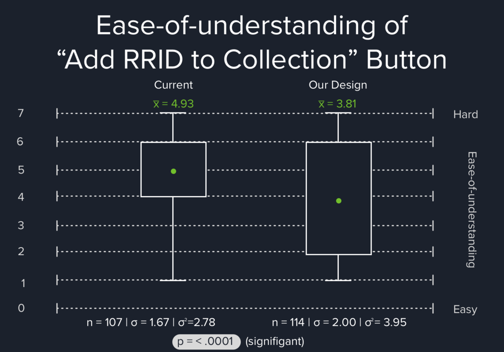
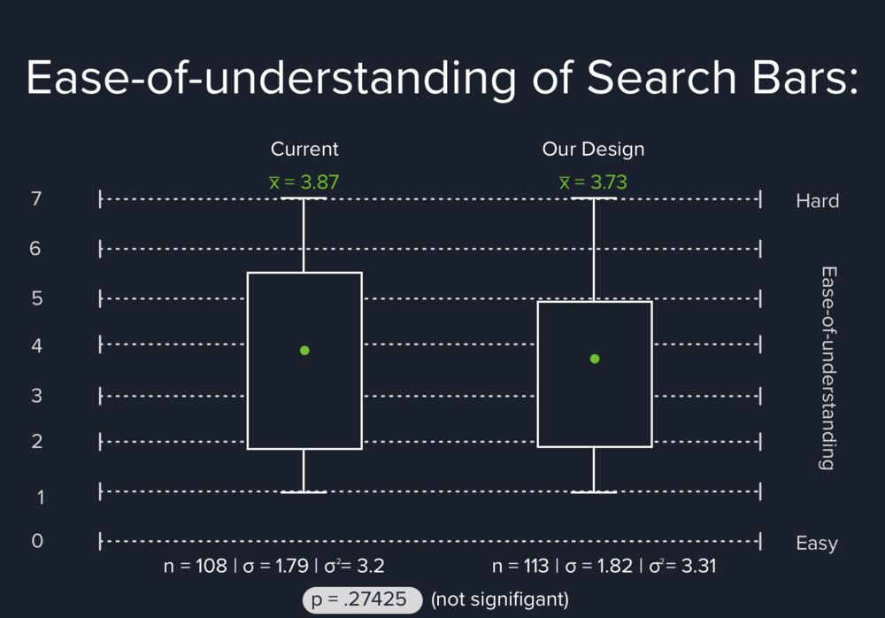
Our team conducted a usability test and an A/B test to examine the effectiveness and changes in our design compared to the original. We asked about ease of use to gain insight and measure improvement from the current SciCrunch RRID Search Portal. This phase is an important step to display that our designs are supported by our research and our UX requirements.
We chose to have both in-person usability tests and a survey-based A/B test because it enables us to have both quantitative and qualitative results. Both tests together allow us to track and discover whether our design of a simplified search bar and a clearer affordance of adding RRID to collections were easier to understand and navigate in the search portal.
Future
Our recommendations are based on our research insights, design insights, and validation findings. The following practices are what we believe to be the best practices to follow when creating a user-friendly search portal with a smoother user flow for users. These recommendations will be passed on to the engineering team in SciCrunch to further implement the changes on the search portal.
DESIGN RECOMMENDATIONS